Cortney’s Place
Cortney's Place is a non-profit day program for adults with developmental disabilities. Serving Phoenix, Arizona since 2007, their goal is to create a stimulating, inclusive, and meaningful day program for their members.
Old LogoNew LogoMultiple locations, one messageCreating a Unified Brand
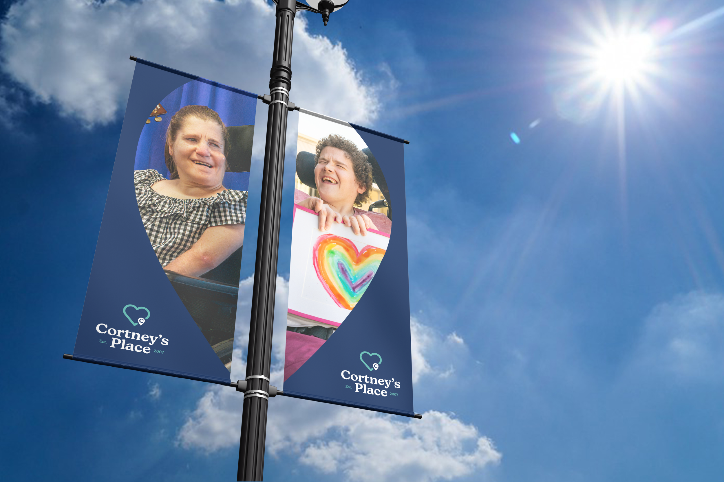
The CEO and Program Director wanted to give Cortney's Place a complete overhaul as they are currently in the process of expanding the non-profit's offering and opening a new location in the West Phoenix area. The new logo and brand identity work in tandem to create cohesive messaging and visuals that represent their mission.
Brand GuidelinesSet up for Success
A comprehensive Brand Guideline was built out to ensure the in house team can continue to put the new brand into effect.
After working closely with the Program Director I was able to get a better understanding of the attributes and messaging that best fit Cortney’s Place. Unique and abstract marks were created to represent each attribute. Here is a selection of those marks.
Brand Attributes
Brand Pattern
I created a pattern out of those brand attributes combined with the vibrant color palette to create a bold and memorable motif that is used throughout the brands identity.
Circle of Love
Circle of Love is a member-based program within Cortney's Place made up of individuals committed to supporting and improving the lives of Cortney’s Place members. These generous donors help Cortney’s Place provide an array of specialized programming and therapy opportunities that enhance the lives of their participants.
New LogoOld Logo


